Because the Federal Reserve of the United States (Fed) is the biggest central bank in the world and the United States economy is the number one economy, the role of U.S. economic data in any fundamental analysis is crucial. Moreover, the dual mandate the Fed has makes a solid case for more data to be considered. The interest rates on the dollar are the one thing that matters the most to the Forex market. To be honest, not only the currency market is influenced. Equities are affected as well. For example, when the Fed is hiking the interest rates, the one place to be from an equity point of view is in banking stocks. A higher interest rate allows for higher revenues for the banking system. And the list can go on, using other things to correlate the move a central bank is making with the stock market. Bonds are influenced as well, not to mention the other currencies on the Forex dashboard due to the interest rate differential that is created. In the Eurozone, the interest rates are in negative territory, -0.5%, while in the United States are positive and rising. Currently, at the moment this article is written, they sit at 0.75% and are forecasted to rise to 1%. With a plus, not a minus! This interest rate differential is influencing flows into or out of a currency/currency pair. While it could be that for some specific period a currency pair will move in a divergent mode, but, in the end, the interest rate differential will have the last saying. In Australia, the interest rates, as set by the Reserve Bank of Australia (RBA), are currently at 1.5%. Compared with the ones in the United States and Eurozone, they offer a different picture. The interest rate differential is positive for the Australian dollar against the U.S. dollar, and positive for it against the Euro as well. Between the two, the differential is bigger against the Euro. In other words, if one is looking to buy the Australian dollar against something, between the two options listed above, the second one is the recommended one. It is no wonder that since middle 2015 the EURAUD cross is moving in a bearish manner, from approximately 1.60 to the current 1.40 level. That is the moment the European Central Bank (ECB) started to cut rates further and faster than the RBA. Thus, the currency pair reflects this difference. Traders can form an educated guess about what a central bank is doing at the next meeting. Part of this process is to look and interpret economic data.

Welcome Bonus
100%
Min Deposit: $100
Profit Split: up to 90%
Accounts: $25k-$200k
Challenge: 2-phase, no time limit
Welcome Bonus
10% up to $5,000
Min Deposit: $100
Welcome Bonus
$25
Min Deposit: $100
Welcome Bonus
100% Deposit Bonus
Min Deposit: €10
Welcome Bonus
100%
Min Deposit: $0
Welcome Bonus
$30
Min Deposit: $5
Bonus
NONE
Min Deposit: $100
Welcome Bonus
$50 Free
Min Deposit: $500
* T&C’s apply to each of the offers. Click “Trade” for more details
The Orange Data
The orange data is still part of second tier data. It is important, definitely more important than the yellow one, but not as important as the crucial events, reflected with the red color in any economic calendar. Prices will move and the U.S. dollar will react if the orange economic data differs widely from the forecasted value. If not, it is considered in line with expectations. The U.S. data is allowing for an in-details analysis of the American economy. Below there are a couple of orange data examples, but consider that these were picked on a random basis and are not the most representatives of them all.
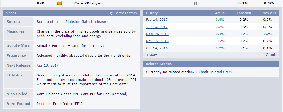
The Core PPI m/m
This is a monthly release. While it is represented with the orange color, it is important as it is referring to inflation. The PPI stands for Producer Price Index and shows the changes in the price of finished goods and services sold by producers. Not all products are considered, though: food and energy are excluded. Food and energy have volatile prices (only think of the oil prices in the last two years or so!) and the core release intends to be more stable. For this, it is preferred by the Fed when it is looking at inflation at the producers’ level. There is a strong correlation between the PPI and the CPI (Consumer Price Index). The CPI is part of the Fed’s mandate and it is known that the PPI inflation, if any, in the end, will be transmitted to consumers as well. Hence, a higher PPI print, bigger than the expected value, should be bullish for the dollar. Chances are that, in time, such an increase will be seen in the consumer prices as well and the Fed will have no way out of it but to become hawkish and eventually hike the rates.
Coming back to the actual release, this is made publicly available around two weeks after the month is ending. As a rule of thumb, if the actual is bigger than the forecast, it is being perceived as a bullish outcome for the currency, the U.S. dollar in this case. The bigger the difference between these two values, the stronger the move in the dollar will be. For example, this March 2017 release is expected to come at 0.2%, when compared with the previous 0.4% print. A small decline is expected and the market’s reaction will be muted for any print around 0.2%-0.3%, but it should be significant for any lower values. Past data is important as well, if a trend can be built.
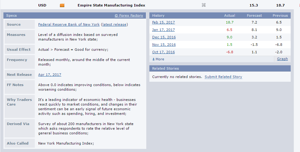
Empire State Manufacturing Index
Still a second-tier data, the Empire State Manufacturing Index is a survey for the New York manufacturing area. Because New York is a big manufacturing center in the overall U.S. manufacturing sector, changes in this index may give a clue about the shape of the U.S. economy.
This indicator is interpreted based on the zero level. In a way, the interpretation is similar to the one for the PMI’s and the 50 level. Above zero values show a sector that is improving, while below show worsening conditions. The bigger the value, the better for the currency. This print for March 2017 shows an expected 15.3 number to come after previously 18.7. It shows a potential decline, but if one looks at the overall interpretation, it is still above the zero level and shows a sector that is in expanding territory. The reason why this data is a second-tier one comes from the fact that the U.S. economy is a service-based economy, not a manufacturing one. In a service based economy, the Gross Domestic Product (GDP) is formed mostly out of services. While manufacturing data still matters for the economy, the data tends to be overlooked if it is in line with expectations. If the services sector confirms the strength or the weakness of the manufacturing one, or, in other words, if they are moving in the same direction, the central bank will react sooner rather than later.
Recommended Further Readings
- Fundamental Analysis – Explaining the U.S. Economic Data – Part 1
– Covering all data that matters from the United States – 1st part - Fundamental Analysis – Explaining the U.S. Economic Data – Part 3
– Explaining the U.S. Economic Data – Part 3 - Fundamental Analysis – Explaining the Eurozone Economic Data
– Covering the economic data that matters for the Eur- pairs - Fundamental Analysis – Explaining the United Kingdom Economic Data
– Covering the economic data that matters for the GBP pairs - Fundamental Analysis – Explaining the Canadian Economic Data
– Covering the economic data that matters for the CAD pairs - Fundamental Analysis – Explaining the Australian Economic Data
– Covering the economic data that matters for the AUD pairs - Fundamental Analysis – Explaining the Japanese Economic Data
– Covering the economic data that matters for the JPY pairs
Other Educational Materials
- The American customer satisfaction index: nature, purpose, and findings. Fornell, C., Johnson, M. D., Anderson, E. W., Cha, J., & Bryant, B. E. (1996). the Journal of Marketing, 7-18.
- “Utilizing economic indicators in explaining foreign direct investment in the US.” Ajami, Riad A., and Ran BarNiv. Management International Review (1984): 16-26.