Golden and death crosses are a symbol of the Western approach to technical analysis. They refer to two moving averages crossing and the implications of such a cross are powerful. When a golden cross is forming, a bullish environment is in place, while a bearish one is present when a death cross appears. The aim of this article is to define the pattern and look at some examples. As a rule of thumb, the bigger the time frame the pattern appears on, the bigger the implications for the trend to follow. In other words, a golden cross on the monthly chart should be treated as being more important than one on the hourly time frame.
Defining the Pattern
As mentioned earlier, there are two moving averages involved. There is a debate whether the moving averages used should be simple ones (SMA – Simple Moving Average) or exponential ones (EMA – Exponential Moving Average). The truth is that it makes no difference. While the EMA is having the advantage that it adapts quicker to changes in the current price, this advantage is almost invisible when the average is applied on bigger time frames.

Welcome Bonus
100%
Min Deposit: $100
Profit Split: up to 90%
Accounts: $25k-$200k
Challenge: 2-phase, no time limit
Welcome Bonus
10% up to $5,000
Min Deposit: $100
Welcome Bonus
$25
Min Deposit: $100
Welcome Bonus
100% Deposit Bonus
Min Deposit: €10
Welcome Bonus
100%
Min Deposit: $0
Welcome Bonus
$30
Min Deposit: $5
Bonus
NONE
Min Deposit: $100
Welcome Bonus
$50 Free
Min Deposit: $500
* T&C’s apply to each of the offers. Click “Trade” for more details
The Golden Cross
A golden cross forms when the MA(50) is moving above the MA(200). The MA(50) considers the last fifty candles to plot the value of the average, while the MA(200) considers the last two hundred. As a rule of thumb, when a lover moving average is crossing a bigger one is a sign of the trend changing direction. The bigger the period the other moving average is considering, the better for the reversal pattern. The chart below shows the MA(50) in brown crossing above the MA(200) in blue and this is the definition of a golden cross. The time frame is the daily one on the EURUSD pair and it is a significant one for the cross to have implications across the whole Forex dashboard.
It can be seen that price hesitated a bit when it crossed the MA(200), for a day or to, exploded higher, only to retrace the move and find resistance in the average. The resistance or support level given by a moving average is a dynamic one, and not a static level, which makes it even more powerful.
The Death Cross
A death cross is, of course, similar, only that it signals a bearish trend to follow. Like it is accustomed, a bearish trend is followed by a steeper declining angle than in the case of a bullish trend. This is because panic is influencing the way traders react and this is different than in a rising trend. A death cross on the monthly chart is far more important than one on the daily time frame. Nevertheless, strong trends are forming on the daily time frame as well and the death cross is a confirmation that the trend already started. It doesn’t mean that the market will not bounce anymore, but it means that the bounces should be interpreted as only spikes and destined to be sold.
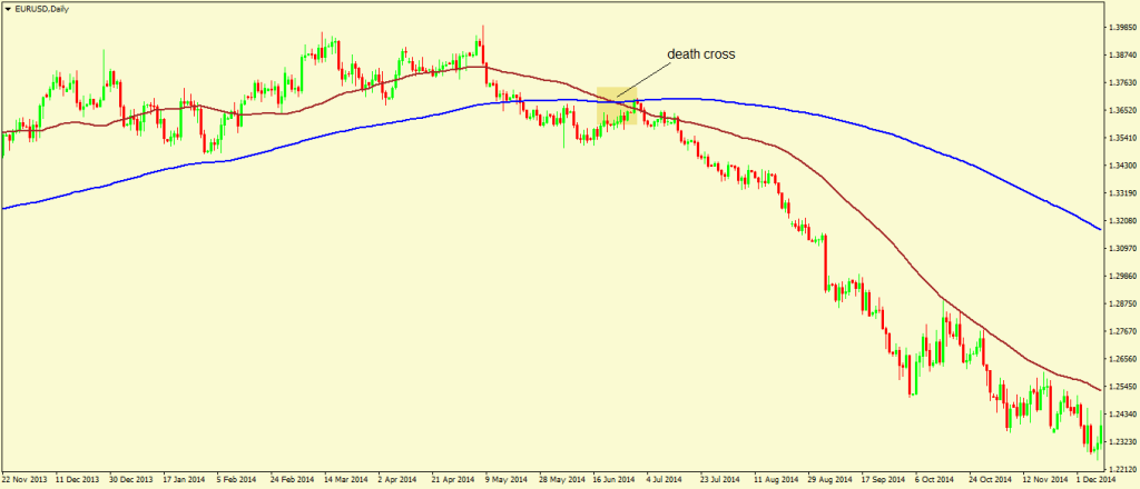
The death cross above formed on the daily EURUSD time frame and at the moment it appeared on the chart, the bearish trend already started. To have an idea about the trend I’m talking about, this is the move from the 1.40 level to the 1.03 area, and the death cross showed us when the trend started. Actually, it showed us the trend already started. The real information is that the trend started and from the moment the cross appeared we should look to sell any bounce. Keep in mind that a moving average is the perfect dynamic support and resistance level and therefore the moment the price is reaching the moving average, bulls or bears should step in. As a rule, the more the moving average is tested or touched by price, the weaker the trend is. I would say that the first two or three touches of the moving average are deserved to be traded. Multiple testing implies the trend is about to change. If you want to be ahead of the game, and involved in scalping or even short-term swing trading, look for placing multiple moving averages on a chart. You can start with the MA(20) and go all the way up to the MA(200). The domino effect should be the one to govern a trade and the time frames should be the ones to show the strength of a trend. The more crosses appear, the more chances the trend will reverse. The bigger the time frame the cross appears on, the bigger the implications for the pair. This is why moving averages are an important tool in the overall technical analysis picture and the bigger time frames are always favored. The most important trend indicators will be treated in the next article and the idea is to highlight the strengths and weaknesses they have. In the end, it is important to stay profitable and the account to grow, no matter what the reason for buying or selling is.

Recommended Further Readings
- Forex Trading – Explaining the Concept
– What is forex trading, generalities about trading the currency market. - Why Trading Forex?
– Advantages and disadvantages of trading the currency market, what are trader’s expectations and what is a realistic approach to follow - What is a Forex Broker and Types of Brokerage houses
– Explaining what a Forex broker is and does, how the business should be organized, and how many types of Forex brokers exist.
Other Educational Materials
- Quantity and Price Indicator for Technical Analysis in the Stock Market. Chen, S. H., Wang, Y. H., & Wang, C. B. (2013). 27, 1-7.
- “Can chartists outperform the market? Market efficiency tests for “technical analysis” Neftci, Salih N., and Andrew J. Policano. .” Journal of Futures Markets 4, no. 4 (1984): 465-478.